
HTML and CSS essentials
- Lesson 2
- 55 min
- Module 1: Web foundations bridge
Lesson 2 of 19 · Frontend Architecture and Performance for AI AppsHTML and CSS essentials
1. Web foundations bridge
2. Components and application structure
3. Data fetching and state management
4. AI-specific interaction states
5. Performance and scalability
6. Security, accessibility and handoff
What you will be able to do
Write the first page of the ticket desk: a form for a new ticket and a place for the list. Use HTML elements that say what each part is, so that browsers, keyboards and screen readers understand the page. Add CSS that makes it readable on a desktop and on a phone.
Before you startWhat to know and to have ready
What you need to know
- How to run the mock ticket API and open its address in a browser, from Set up the ticket desk.
What you need on your computer
- The folder
~/projects/ticket-desk, copied from the snapshotstart, open in VS Code. - The mock API running in terminal 1:
node mock-api/server.mjs.
At the end of this lesson, the folder has two new files, bridge/index.html and bridge/styles.css. They are the same as in the snapshot end-of-m01. If you get lost, copy them from there.
A paper form
Section titled “A paper form”Think of a paper form at a post office: “Report a lost parcel”. It has a title at the top. It has boxes, and each box has a printed question next to it: “Customer number”, “What happened?”. At the bottom, there is a place to sign. You never wonder which box is for what, because each box has its question.
The same form can be printed in many ways: in black and white or in colour, on one page or on two narrow columns. The questions do not change; only the look does. A good post office keeps the two jobs apart. One person decides the questions, and a print shop decides the paper, the fonts and the layout.
A web page has the same two jobs. HTML (HyperText Markup Language) says what is on the page and what each part is. A part can be a title, a question, a box to type in or a button. CSS (Cascading Style Sheets) says how it looks: colours, sizes, spaces and columns.
The problem: the browser only gets text
Section titled “The problem: the browser only gets text”Sam’s first page must show “New ticket”, three fields and a Send button. But a browser receives a page as plain text. How can it know that “New ticket” is a heading? Or that a box takes typing, and that “Send ticket” sends the form?
Without marks in the text, it cannot. And it is not only the look that suffers. Camille, an agent in Montréal, uses a keyboard and a screen reader for parts of the day. A screen reader is a program that reads the page aloud. It lets them jump from heading to heading and from field to field. A screen reader needs to know what each part is. A box that only looks like a field is useless to them.
The idea: elements, marked with tags
Section titled “The idea: elements, marked with tags”HTML puts marks around each part of the text. A mark is a tag, a name in angle brackets. A start tag and an end tag around some content make an element:
<h2 id="new-heading">New ticket</h2>Read it part by part:
<h2>is the start tag.h2means “a heading of level 2”: a section title under the page’s main title,h1.New ticketis the content: the words that the page shows.</h2>is the end tag, with a slash.id="new-heading"is an attribute: an extra setting in the start tag, asname="value". Anidgives the element a name that must be unique on the page.
Some elements have no content, so they have no end tag. <input id="subject" name="subject" required /> is one: a box to type in. Its attributes say everything about it.
Elements go inside elements, as boxes inside boxes. A <form> holds labels, fields and a button; a <section> holds a heading and the form. So the browser reads a page as a tree: one element at the top, <html>, and every other element inside exactly one parent. The next diagram shows the tree of Sam’s first page as nested boxes.

Text description of the diagram
The <body> holds everything that the page shows. Inside it, a <header> holds the page title, <h1>, and <main> holds the content. <main> has two <section> elements. The first one has the heading “New ticket”, the form and an empty paragraph for the answer. The form has three pairs of a <label> and a field, and a button. The second section has the heading “Newest tickets” and a list, <ul>, with one item, “Loading…”. In the next lesson, JavaScript replaces that item with the tickets.
Elements that say what they are
Section titled “Elements that say what they are”HTML has more than 100 elements. Each one has a meaning, and the browser gives each meaning some behaviour for free. Elements chosen for their meaning, not for their look, are called semantic elements. The first page needs only these:
| Element | What it is | What the browser does with it |
|---|---|---|
<header>, <main>, <section> |
the top of the page, the main content, a part with a heading | a screen reader can jump to them |
<h1>, <h2> |
the page title, a section title | a screen reader lists them as a table of contents |
<form> |
a set of fields that are sent together | Enter in a field sends it |
<label> |
the question of one field | clicking it puts the cursor in the field; a screen reader reads it |
<input>, <textarea> |
a one-line box, a box with many lines | takes typing, checks its rules |
<button> |
a button | works with a mouse, Enter and Space |
<ul>, <li> |
a list, one item of it | a screen reader says “list, 10 items” |
<p> |
a paragraph of text |
Sam asks: “Why not use <div> for everything and make it look right with CSS?” A <div> is an element with no meaning: a plain box. The focus is the one element that gets the keys you type; Tab moves it to the next field or button. A <div> that looks like a button does not take the focus, and it does nothing with Enter. A screen reader does not call it a button. You would have to rebuild all of that with code. A <button> has it for free.
Write the first page
Section titled “Write the first page”The mock API serves the files of a folder named bridge at http://127.0.0.1:8100/, if the folder exists. “Bridge” is the name of this module’s page without any tools. You write it now.
-
In VS Code, make a new folder
bridgeinticket-desk. Then make the filebridge/index.html. -
Type, or paste, this page into
bridge/index.html, and save it:bridge/index.html <!doctype html><html lang="en"><head><meta charset="utf-8" /><meta name="viewport" content="width=device-width, initial-scale=1" /><title>Ticket desk (first page)</title><link rel="stylesheet" href="styles.css" /></head><body><header class="top"><h1>Larkfield ticket desk</h1></header><main class="layout"><section aria-labelledby="new-heading" class="card"><h2 id="new-heading">New ticket</h2><form id="new-ticket"><label for="customer">Customer ID</label><input id="customer" name="customer_id" required pattern="C-[0-9]{4,5}" placeholder="C-0022" /><label for="subject">Subject</label><input id="subject" name="subject" required maxlength="120" /><label for="body">Message</label><textarea id="body" name="body" required rows="4" maxlength="5000"></textarea><button type="submit">Send ticket</button></form><p id="answer" role="status"></p></section><section aria-labelledby="list-heading" class="card"><h2 id="list-heading">Newest tickets</h2><ul id="tickets" class="tickets"><li>Loading…</li></ul></section></main><script type="module" src="app.js"></script></body></html> -
Open
http://127.0.0.1:8100/in your browser. If you see the JSON message of the last lesson, check the folder name:bridge, next tomock-api.
The page has two parts. <head> holds information about the page: the character set, the title of the browser tab, and two links. <body> holds what the page shows. Three lines in <head> matter for later:
<meta name="viewport" …>tells a phone to use its real width. Without it, a phone draws the page as a desktop page, very small.<link rel="stylesheet" href="styles.css" />loads the CSS file. It does not exist yet.<script type="module" src="app.js">loads the JavaScript of the next lesson. It does not exist yet either.
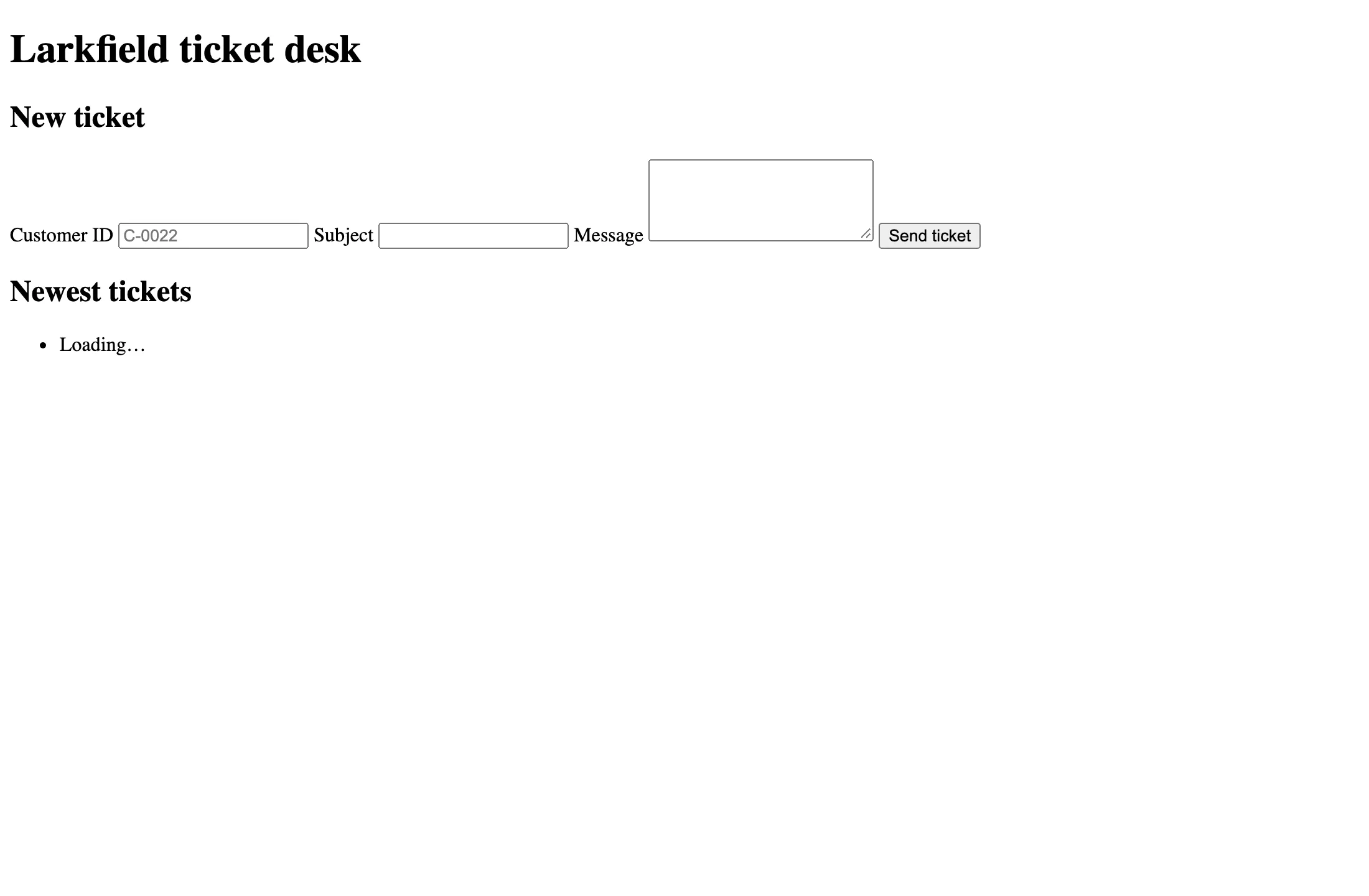
The page works, but it is not pleasant. Look at terminal 1: the browser asked for three files.
GET / 200 0 msGET /styles.css 404 0 msGET /app.js 404 0 msThe two 404 answers are expected: those files come next. Each file that a page links to is one more request.
Forms check their own rules
Section titled “Forms check their own rules”Read the attributes of the fields again. required means “this field cannot be empty”. pattern="C-[0-9]{4,5}" means “the text must be C-, then four or five digits”, as in C-0022. maxlength="120" stops the typing at 120 characters. placeholder shows an example in grey while the field is empty.
The browser checks these rules before the form leaves the page. The course team filled in 22 as the customer ID, left the subject empty, and asked Chromium what each field would say:
| Field | Value | The browser’s message |
|---|---|---|
| Subject | empty | Please fill out this field. |
| Customer ID | 22 |
Please match the requested format. |
Chromium shows the message in a small bubble next to the first wrong field, and the form is not sent. Firefox and Safari use other words. These checks help the agent, but they do not protect the API: anyone can change the page in their browser, or send a request with curl. The API checks every request again, as in Validation and error responses.
Now fill in the form correctly (C-0022, Parcel lost, It did not arrive.) and select Send ticket. The page reloads, and the fields are empty again. Where did the ticket go? Look at the address bar and at terminal 1:
http://127.0.0.1:8100/?customer_id=C-0022&subject=Parcel+lost&body=It+did+not+arrive.GET /?customer_id=C-0022&subject=Parcel+lost&body=It+did+not+arrive. 200 0 msWithout a script, the browser sends a form itself, in the oldest way. It sends a GET request to the same page, with each field’s name and value in the address. The API does not know that address, so it sent the page again. No ticket was saved. To send the ticket as JSON to POST /v1/tickets, the page needs JavaScript: the next lesson.
CSS: rules that style elements
Section titled “CSS: rules that style elements”CSS is a list of rules. A rule has a selector, which chooses elements, and declarations in braces, which set a property to a value:
h1 { margin: 0; font-size: 1.4rem;}The selector h1 chooses every <h1> element. margin: 0 removes the space around it, and font-size: 1.4rem makes its text 1.4 times the base size. The unit rem is the size of the page’s base font, often 16 pixels, so 1.4rem is about 22 pixels. Sizes in rem grow when a person sets a larger font in the browser; sizes in px do not.
A selector can choose elements in several ways:
h1chooses by element name..cardchooses every element withclass="card". A class is a label that you put on elements to style them together. Both sections have it.#answerchooses the one element withid="answer".:focus-visiblechooses the element that has the keyboard’s focus, when the browser shows it.
Every element is a box with three layers around its content: padding (space inside the border), border, and margin (space outside). The .card rule uses all three.
Now make bridge/styles.css. The first lines set colours as custom properties, names that start with --, so that each colour is written once and used with var(--ink):
/* Module 1's page: a few rules for type, a two-column layout and readable forms. */:root { --ink: #1d2733; --muted: #5b6673; --line: #d5dbe1; --accent: #1f5fa8; --paper: #ffffff; --page: #f4f6f8; font-family: system-ui, -apple-system, 'Segoe UI', sans-serif; color: var(--ink); background: var(--page);}Copy the whole file from the snapshot: ~/projects/nextia-learning-labs/C22/snapshots/end-of-m01/bridge/styles.css, into bridge/. It has 98 lines, with short comments. Save it, and reload the page.
Layout: one column on a phone, two on a desktop
Section titled “Layout: one column on a phone, two on a desktop”A page must work on a 13-inch laptop and on a phone. The same rules cannot fit both, so CSS has a way to change the layout with the screen’s width. That is responsive design. The page uses two tools for it:
/* One column on a phone, two columns when there is room. */.layout {  display: grid;  gap: 1rem;  padding: 1rem;  max-width: 70rem;  margin: 0 auto;}
@media (min-width: 48rem) {  .layout {    grid-template-columns: 1fr 2fr;  }}
display: grid makes <main> a grid: its children, the two sections, are placed in rows and columns. With no columns set, there is one column, so the sections stack. The media query @media (min-width: 48rem) applies its rules only when the window is at least 48rem wide (768 pixels). Then the grid gets two columns. 1fr 2fr means “share the width in three parts: one for the form, two for the list”. max-width: 70rem and margin: 0 auto keep the page centred on a very wide screen.
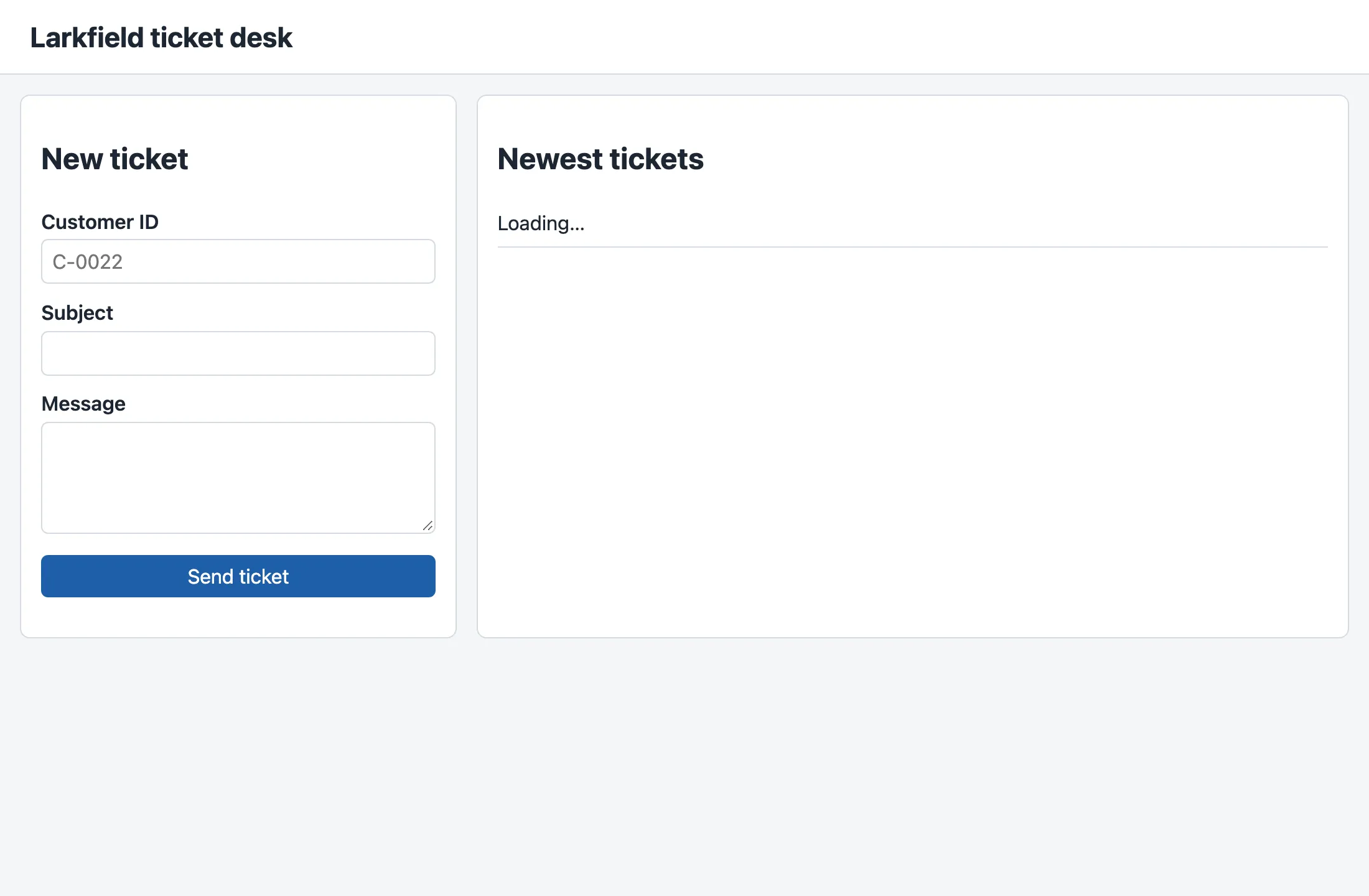
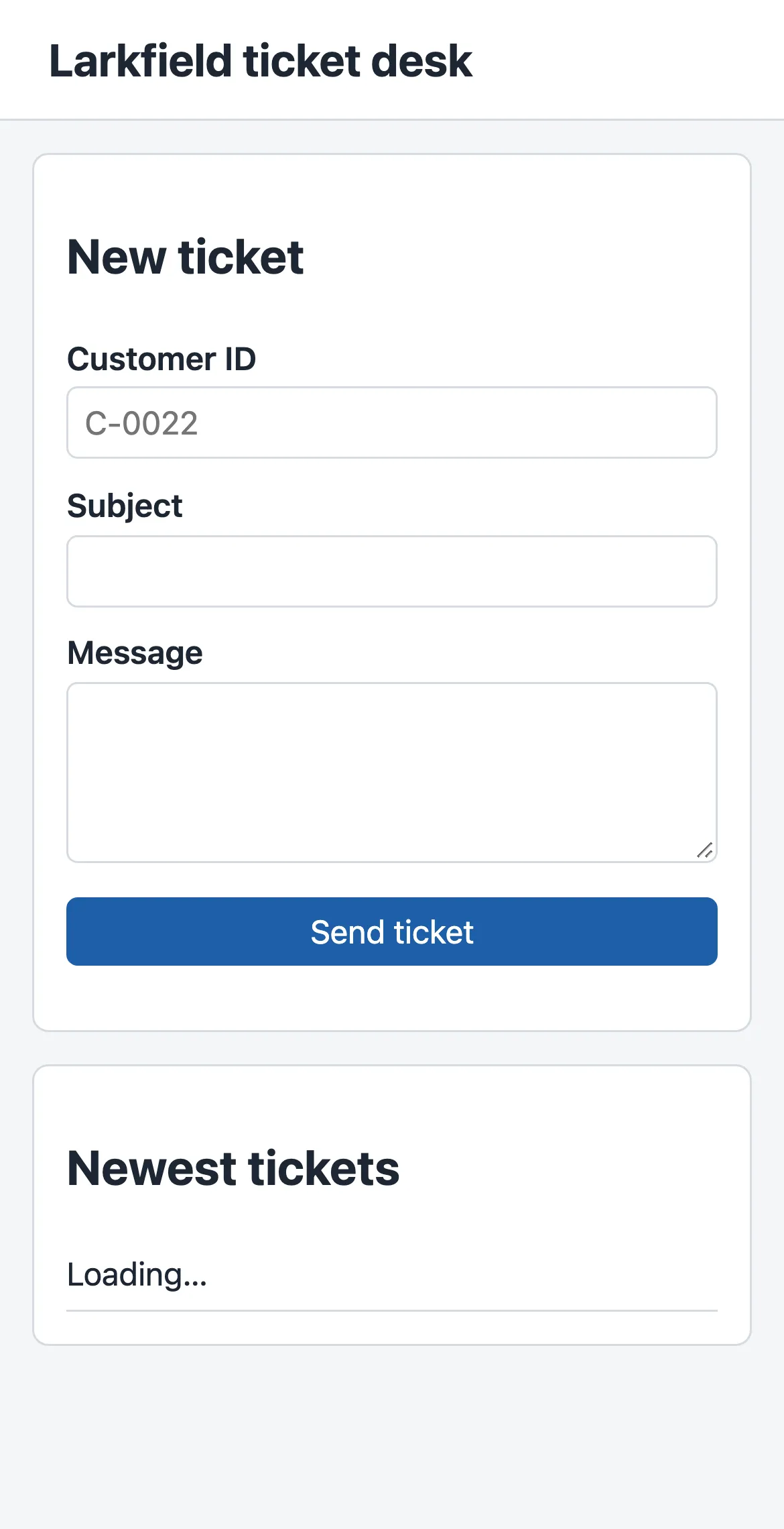
The HTML did not change between the three screenshots. Only the CSS did. That is the reason to keep the two jobs apart: a new look never risks the meaning of the page.
Labels that a screen reader can use
Section titled “Labels that a screen reader can use”A <label> connects to its field when its for attribute has the same value as the field’s id: for="customer" and id="customer". Then the field gets the label’s text as its accessible name: the name that a screen reader says when the field gets the focus.
You can see these names. Browsers keep an accessibility tree next to the page: the elements that matter to assistive programs, with their roles and names. In Chrome or Edge, open the developer tools (F12, or Cmd+Option+I on macOS), select a field in the Elements panel, and open the Accessibility tab. The course team printed the form’s part of that tree with Playwright, a tool that drives a browser:
- text: Customer ID- textbox "Customer ID": - /placeholder: C-0022- text: Subject- textbox "Subject"- text: Message- textbox "Message"- button "Send ticket"Each field is a textbox with the name of its label, and the button’s name is its text. Camille presses Tab to reach the first field. Their screen reader says the name “Customer ID”, that it is a field to type in, and that it is required. The CSS rule :focus-visible draws a 3-pixel blue outline around that field, so a sighted keyboard user sees where the focus is too.
When to use what, and what it costs
Section titled “When to use what, and what it costs”Use the element that means what you show: a heading for a title, a button for an action, a label for every field. It costs nothing, and the browser gives you keyboard support and names for free. Use a <div> or <span> only for a box that has no meaning, for example a wrapper for the layout.
Use the browser’s form rules (required, pattern, maxlength) to help people correct mistakes early. Do not rely on them for safety: the server checks again.
Responsive CSS has a cost too: every media query is one more layout to test. This page has one breakpoint, 48rem, and the course checks it at two sizes, a desktop and a phone.
Common mistakes
Section titled “Common mistakes”Common mistake
A label that is not connected: the field gets the wrong name
Symptom: the page looks exactly the same. But when Camille reaches the first field, their screen reader says “C-0022” instead of “Customer ID”.
Cause: the label’s for does not match the field’s id, or the label has no for. The course team removed for="customer" and printed the tree again:
- text: Customer ID- textbox "C-0022"With no label, Chromium uses the placeholder as the field’s name. So the screen reader reads the example, not the question. Without a placeholder, the field would have no name at all.
Diagnose: in the developer tools, select the field and read its name in the Accessibility tab. Or click on the label text: if the cursor does not jump into the field, the label is not connected.
Fix: give the label for="customer" and the field id="customer", with the same word. Every id must be unique on the page.
Common mistake
The page is unstyled, and the log shows 404 for styles.css
Symptom: the page looks like the first screenshot, with every field on one line, although you made styles.css.
Cause: the browser looks for the file at the address in href, next to index.html. The file has another name (style.css), or it is in another folder.
Fix: put styles.css in bridge/, next to index.html, and reload. Terminal 1 must log GET /styles.css 200.
Your turn: an order number
Section titled “Your turn: an order number”Add one optional field to the form: the customer’s order number, such as LK-581106. It must have a label, a placeholder, and a pattern that allows LK- followed by five or six digits. Before you test it, predict: what does the field’s line in the accessibility tree say, and what does the browser say about 581106?
Show the answer
Add these two lines after the subject field, in bridge/index.html:
<label for="order">Order number (optional)</label><input id="order" name="order_id" pattern="LK-[0-9]{5,6}" placeholder="LK-581106" />No required, because the field is optional: an empty field is valid. With 581106, the course team’s Chromium said Please match the requested format., because the text does not start with LK-. LK-581106 is valid. The accessibility tree has a new line:
- textbox "Order number (optional)": - /placeholder: LK-581106The ticket API does not know order_id yet, so the next lesson does not send this field. Remove it again, or leave it out of the form’s data, before you continue. The snapshot does not have it.
Knowledge check
Section titled “Knowledge check”Check your understanding
What is the job of HTML, and what is the job of CSS? Use the paper form to explain why they are kept apart.
Show the answer
HTML says what is on the page and what each part is: a heading, a label, a field, a button. CSS says how it looks: colours, sizes, spaces and columns. On a paper form, the questions are decided once, and the print shop can print them in many layouts without changing a question. In the same way, the first page has one HTML file and looks different on a desktop and on a phone only because of CSS. A new look never changes the meaning that a screen reader or a keyboard uses.
Does your answer have the main points of ours?
Sign in and enroll in the course to save your answers. Every check counts toward the certificate.
Check your understanding
Predict: the window of the first page is 700 pixels wide. How many columns does the layout have, and which CSS line decides it?
Show the answer
One column. The media query @media (min-width: 48rem) applies only from 48rem, which is 768 pixels with a 16-pixel base font. At 700 pixels, its rule grid-template-columns: 1fr 2fr does not apply, so the grid of .layout has one column, and the two cards stack as on the phone.
Does your answer have the main points of ours?
Sign in and enroll in the course to save your answers. Every check counts toward the certificate.
Check your understanding
The form has required and pattern on its fields. Tomás says: 'Then the API does not need to check the customer ID any more.' What do you answer?
Show the answer
The browser’s checks run in the browser, on the user’s computer, and the user controls it. Anyone can remove the attributes in the developer tools, or send POST /v1/tickets with curl, and the browser never sees it. The checks help honest people fix a mistake early. The API must still check every request, because only the server is under Larkfield’s control.
Does your answer have the main points of ours?
Sign in and enroll in the course to save your answers. Every check counts toward the certificate.
Recap
- HTML marks what each part of a page is, with elements: a start tag, content and an end tag, plus attributes. Elements nest, so the page is a tree.
- Semantic elements (
header,main,section,h1,form,label,button,ul) give keyboard support and names to screen readers for free; adivgives nothing. - A
<label for>with the field’sidgives the field its accessible name. Without it, Chromium named the field after its placeholder, “C-0022”. - Forms check
required,patternandmaxlengthbefore they are sent, but without a script the browser sends them as aGETto the same page: no ticket is saved. - CSS rules choose elements with selectors and set properties. A grid with a media query gives one column on a phone and two from 48rem.
Next, you add bridge/app.js: JavaScript that loads the newest tickets and sends the form to the API.
Next: JavaScript essentials